Royal Queensland Golf Club·Short course·Brand guide v0.9
The Knot
Golf & Social
A figure-eight knot, for a figure-eight course. Two loops that meet at the crossover and hold.
01 Architecture
02 The idea
03 The mark
04 Colour
05 Applications
06 Typography
07 Elements
08 In the world
Royal Queensland Golf Club · Brand Guide · v0.9
01
Architecture
An endorsed sub-brand, not a spin-off.
The Knot has its own name, mark and palette, and it never stands entirely alone. Royal Queensland is the reason it is trusted before anyone has played it, so the endorsement is present at the edge of every surface.
MasterRoyal Queensland Golf ClubThe parent. Founded 1920, an Olympic venue, and the authority every other tier borrows from.Refresh Jul–Aug
ChampionshipThe Championship CourseThe main eighteen. Carries the master brand directly, with no separate identity of its own.No change
Short courseThe Knot · Golf & SocialEndorsed sub-brand. Its own name, mark and palette, always shown beneath Royal Queensland.This guide
Event spaceTo be namedIndependent sub-brand. Operates on its own across corporate, entertainment and community, because much of its audience will never play golf.Aug–Sep
Final
Royal Queensland Golf Club · the endorsing mark, final artwork
The endorsement
An endorsed sub-brand is free to have a personality but never free to imply it is a separate business. Royal Queensland appears on every surface The Knot owns.
Royal Queensland sits at the edge of the surface, not inside The Knot lockup. The two marks are never combined into a single device.
The endorsement is set in DM Mono, uppercase, at label scale. It supports; it does not compete.
On anything a non-member sees first (signage, the website, event collateral, advertising) the endorsement is required, not optional.
On items already inside the club and already understood, such as a ball marker or a coaster, the knot may stand alone.
Never place The Knot above or level with Royal Queensland in a hierarchy. It sits beneath it.
Writing the name
The full name is The Knot · Golf & Social. Golf & Social is the verbal anchor and does the heavy lifting in any context where the name is meeting someone for the first time.
Write it this way
The Knot · Golf & Social
The full lockup. First mention anywhere, all signage, anything public-facing or search-facing.
The Knot
Second mention onward, and inside the club where the name is already understood.
The Knot at Royal Queensland
Where the endorsement has to be carried in the sentence rather than in the layout.
Never
Knot Golf & Social
The article is load-bearing. Without it the name reads as a product, not a place.
THE KNOT
Never set the name in all caps. The wordmark is mixed case and the artwork is the only correct rendering at size.
the knot
Both words take a capital in running text.
Royal Queensland Knot
The two brands are never merged into one name.
02
The idea
Two loops, one crossover.
The short course runs as a figure eight. Ten holes that fold back on themselves and meet once, at the crossover. Walk it and you cross your own path exactly halfway through the round.
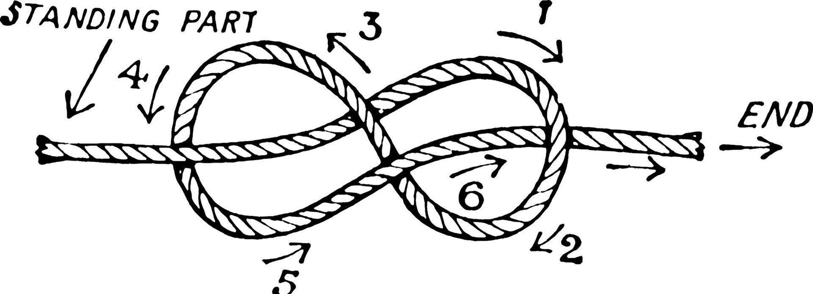
That shape is already a knot. The figure eight is the knot a climber ties when the rope has to hold under load, and the one a sailor ties so a line cannot run out through a block. It is the knot you use when the thing must not come apart.
So the mark is not a picture of the course, and it is not decoration. It is the course's own geometry doing a second job.
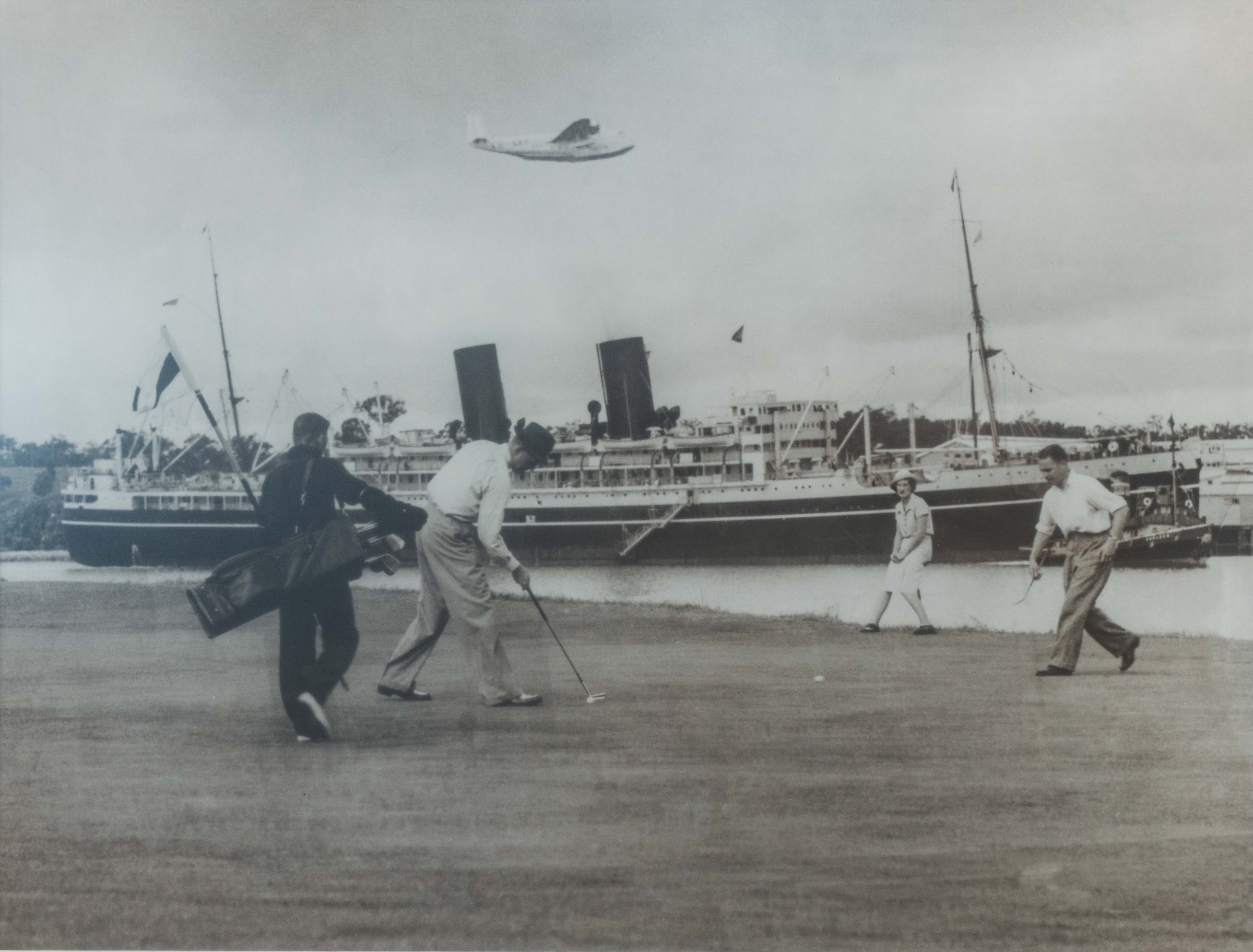
Royal Queensland, late 1930s · a putt, a liner and a flying boat in one frameClub archive
01The routing
Two loops meeting once at the crossover. The plan of the course, drawn in rope.
02The knot
A figure eight. Tied to hold under load and to not run out. The one you use when it matters.
03The tie
Grandparent and grandchild round the same ten. A short course exists to hold generations together.
03
The Knot · Golf & Social
The mark, and how it holds together.
A figure-eight knot. It reads two ways at once: the short course's figure-eight routing, two loops meeting once at the crossover, and the tie between generations that the course is built to hold. Four forms, one palette, no separate export per colourway.
Primary lockup
The default. Mark above wordmark, with the descriptor set beneath. Use this wherever there is room to give the mark air.
Wordmark
Type alone, for contexts where the mark already appears nearby or the space is too narrow to carry it. Never redraw or re-set the letterforms.
The knot
The mark on its own. Social avatars, ball markers, embroidery, pin flags, anywhere the name is already understood.
Badge lockup
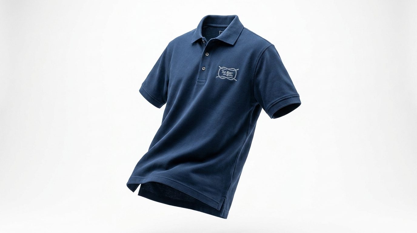
The contained form. Apparel, signage roundels, scorecards and anywhere the mark needs its own boundary against a busy ground.
Colourways
Live artwork, recoloured. Every mark is a single-fill SVG, so the
whole palette is available from one file per form rather than a
separate export per colour.
Ink on paperThe default. Use unless there is a reason not to.
Cream on blackThe primary reverse.
Cream on petrol
Cream on red
Ink on sage
Ink on funnel
Clearspace
Clearspace equal to the height of the knot itself, on all four sides. Nothing enters that field, including type, rules, image edges and the trim of the page.
On the badge lockup, measure from the outer boundary of the badge rather than from the artwork inside it.
Minimum size
14mmPrint, mark width
96pxDigital, mark width
Below these sizes the knot's interior crossings begin to fill in. Where a smaller mark is unavoidable, use the wordmark alone rather than a knot that has gone solid.
Misuse
Do not re-set the wordmark in another typeface.
Do not change the relationship, spacing or scale between the knot and the wordmark.
Do not apply colours outside the approved palette to any part of the mark.
Do not use two colours within a single instance of the mark.
Do not outline, emboss, or apply a drop shadow.
Do not rotate, slant or italicise any form of the mark.
Do not distort or stretch the proportions.
Do not place the mark on a photograph without sufficient tonal separation.
Do not enclose the primary lockup in a shape. Use the badge lockup instead.
Do not reproduce the mark below the minimum sizes above.
Two grounds, two inks, five accents drawn from the river, the turf and the light. Shown here at something like the area each will actually occupy.
Primary · text and mark#0C3347
Ink
The mark and body text on light grounds. A deep navy rather than a black, and the same navy the Royal Queensland crest is drawn in, which ties the two brands together without either mark changing. Never pure black anywhere in the system.
Primary · ground#F7F2F0
Paper
The default page. Scorecard stock, menus, the guide you are reading. Everything starts here.
Ground · reverse#1B1D1C
Black
The dark ground. Signage, apparel, the reverse of print, and the cover of anything that wants weight.
Primary · reverse ink#E7DFC8
Cream
The mark and text on dark grounds. A ground for small panels only, never a field for body copy.
Accent · the river#2E4B59
Petrol
The deepest accent and the one carrying the Brisbane River. Use where the course meets the water.
Accent · the turf#B5CCB0
Sage
Course-facing work. Hole diagrams, yardage, scorecards, anything about the ground underfoot.
Accent · the stacks#F4C23B
Funnel
Pulled from the funnels of the liners that berthed alongside the course. The social and wayfinding accent, and the only colour in the palette loud enough to be found from a distance.
Accent · premium#C29053
Gold
Milestones, member gifts, a substitute for foil. Use sparingly or it stops reading as premium.
Accent · alert#A13B2C
Red
Competition and emphasis, at small sizes only. Never a large field and never behind body copy.
Tints, shades and opacities
Every ground and accent carries a six-step tint ramp, a three-step shade ramp and a five-stop opacity scale. Generated from the base hex, so they cannot drift. Tints carry panels, table fills and hover states; shades carry pressed states and rules; opacities carry overlays on photography.
Ink
100200300400500600Base800850900
8%16%32%56%80%
Paper
100200300400500600Base800850900
8%16%32%56%80%
Black
100200300400500600Base800850900
8%16%32%56%80%
Cream
100200300400500600Base800850900
8%16%32%56%80%
Petrol
100200300400500600Base800850900
8%16%32%56%80%
Sage
100200300400500600Base800850900
8%16%32%56%80%
Funnel
100200300400500600Base800850900
8%16%32%56%80%
Gold
100200300400500600Base800850900
8%16%32%56%80%
Every approved pairing
All fourteen combinations, each with its measured contrast ratio and what that ratio permits. Anything marked display only is for the mark and large headings, never for body copy.
AaA better round, not a longer one.
Ink on Paper AAA 11.97:1The default. Body copy, long-form, scorecards.
AaA better round, not a longer one.
Cream on Black AAA 12.74:1The primary reverse. Signage, apparel, covers.
AaA better round, not a longer one.
Paper on Ink AAA 11.97:1Table headers, pull quotes, dark panels.
AaA better round, not a longer one.
Cream on Petrol AA 6.96:1River-facing wayfinding and hole signage.
AaA better round, not a longer one.
Cream on Red AA 4.97:1Competition boards and alert states.
AaA better round, not a longer one.
Ink on Sage AAA 7.74:1Scorecard panels, yardage, turf-facing print.
AaA better round, not a longer one.
Ink on Funnel AAA 7.99:1Wayfinding, event collateral, pin flags.
AaA better round, not a longer one.
Petrol on Paper AAA 8.34:1Headings and rules on the default page.
AaA better round, not a longer one.
Red on Paper AA 5.95:1Emphasis and correction marks at small size.
AaA better round, not a longer one.
Sage on Ink AAA 7.74:1Course data on dark panels.
AaA better round, not a longer one.
Funnel on Petrol AA 5.57:1High-visibility wayfinding only.
AaA better round, not a longer one.
Ink on Cream AAA 9.99:1Small warm panels inside a dark layout.
Drawn from the ephemera the palette came out of: bus and admission tickets, theatre stubs, luggage tags. Punch grids, serial numbers, perforations, sideways margin type. Built live from the same tokens as the rest of the guide, so nothing here can drift. Indicative layouts for direction, not final artwork.
Keep this card
Royal Queensland · Brisbane · Ten holes
No 04271
1118PAR 3
292PAR 3
3141PAR 3
4132PAR 3
578PAR 3
6156PAR 3
7104PAR 3
8121PAR 3
988PAR 3
10134PAR 3
OUT1164PAR 30
Not transferable · Retain until the crossover
Scorecard as transit ticket · punch grid, serial, clipped corners
After the turn
To start
Moreton Bay bug roll brown butter24
Kingfish crudo green mango26
Grilled flatbread smoked butter14
The middle
Half chicken charred lemon38
Dry-aged sirloin bone marrow butter52
Whole snapper to share46
Alongside
Leaves and herbs 12
Duck fat potatoes 14
ADMIT ONE · 8891
Menu as admission stub · perforated head, tan rules
Guest pass
Name
Member
Date
Tear below · retain stub
12·4
Guest pass as luggage tag · eyelet, ruled fields, tear-below
Crossover
Two loops meet here · Give way to players on the inward loop
Course signage · cream on petrol
Ten rounds · Season pass
A. Mitchell
No 00318
1 2 3 4 5 6 7 8 9 10
Valid to 31 March · Not transferable · Present at the pro shop
Season pass · ten rounds, punched down as they are used
The Knot
Golf & Social
Coaster · knot in red on board, the social half of the name
Ball marker
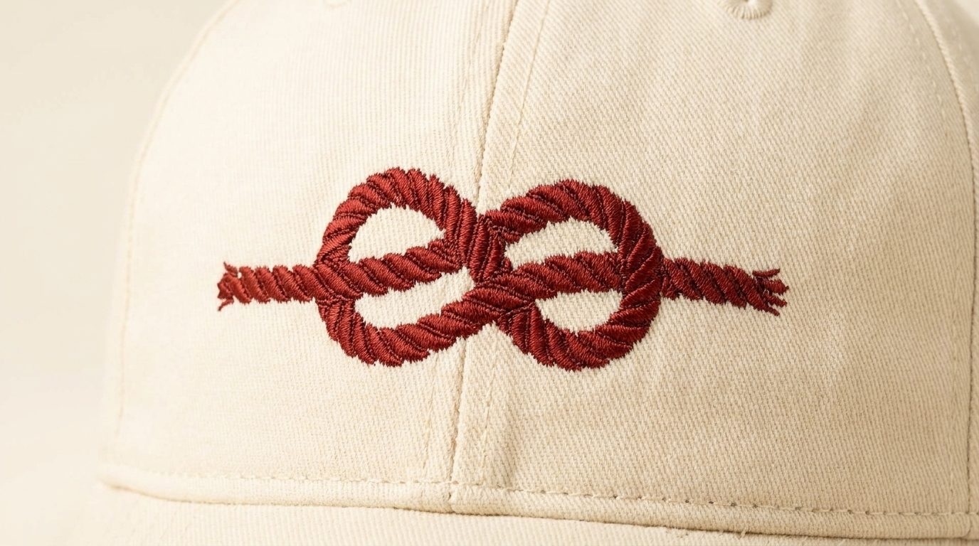
Cap patch
Avatar
Merchandise and digital · ball marker, cap patch, avatar
06
Typography
Three faces, one job each.
Mackinac carries every headline and every line of body copy. DM Mono does labels, numerals and instructions, and nothing else. Chippewa Falls is allowed one hand-lettered line and no more. The discipline is that simple, and holding it is what stops the brand looking like three brands.
display
P22 Mackinac Pro
The logotype and every headline. A humanist serif with enough weight in the stem to hold up at signage scale and enough warmth to avoid reading as institutional. Licence required before production use. Served live from Adobe Fonts, so every specimen and heading on this page is the real face. The .otf files in the interim pack are not usable on the web: they are PDF-extraction subsets, with Book carrying no digits 1 to 9 and no J, K, Q, U, X, Y or Z, and Medium holding just six glyphs.
400 500 700
Italic
Aa
The Knot, Golf & Social
mono
DM Mono
Labels, eyebrows, tee markers, scorecard figures and any small all-caps setting. Open licence, so it carries the digital and signage work without a per-seat cost.
400
Aa
The Knot, Golf & Social
heritage
Chippewa Falls
Hand-lettered accents only. Chippewa Falls is a single-case face: it has no true lowercase, and the lowercase keys draw the same capitals at a smaller size. That is why it reads as lettering painted onto a board rather than as somebody's handwriting, and it is why it cannot carry a sentence.
500
Aa
The Knot, Golf & Social
The hierarchy
Every level below is set at the size it specifies. Nothing here is
shrunk to fit a table, and nothing is a screenshot.
D1Display P22 Mackinac Pro · 4.5rem · 1.02 · 500 · -0.02em One per surface, and only where it can be the whole thing. Covers, the top of a page, a signage face. Never twice on the same screen.
A better round, not a longer one.
H1Page title P22 Mackinac Pro · 2.75rem · 1.1 · 500 · -0.015em The title of a page or section. One per page. Always the highest level present unless a D1 is doing the job instead.
Ten holes, one river, no hurry.
H2Section head P22 Mackinac Pro · 2rem · 1.14 · 500 · -0.012em The major divisions inside a page. Menus, the top of a card, a chapter of a longer document.
Golf and social, in that order.
H3Subhead P22 Mackinac Pro · 1.5rem · 1.2 · 500 · -0.008em Groups inside a section. Menu courses, the heading on a rule block, a named field on a card.
After the turn
H4Minor head P22 Mackinac Pro · 1.2rem · 1.3 · 500 The smallest serif heading. Sidebars, list headings, the top of a short block of body copy.
Guest passes and green fees
H5Lead-in P22 Mackinac Pro · 1.05rem · 1.4 · 400 · italic Italic lead-in above or below a heading. Standfirsts, captions with substance, a note that is still prose.
Members and their guests, every day but Tuesday.
H6Structural label DM Mono · 0.7rem · 1.4 · 400 · 0.2em Where the hierarchy needs one more step down and a serif would be too soft. This is the only heading level set in mono.
Section 04
B1Body P22 Mackinac Pro · 1.05rem · 1.6 · 400 Default running text. Anything longer than a sentence. Measure capped at roughly 68 characters.
The short course sits on the bend of the Brisbane River, ten holes that fold back on themselves in a figure eight and meet once at the crossover.
B2Body small P22 Mackinac Pro · 0.92rem · 1.55 · 400 Secondary prose. Menu descriptions, notes under a heading, the second column of a card.
Ten holes from four o'clock, with dinner on the terrace after.
L1Label DM Mono · 0.68rem · 1.4 · 400 · 0.18em Data and wayfinding. Yardages, tee markers, serial numbers, prices on a punched card.
Tee 4 · 132m · Par 3
L2Caption DM Mono · 0.6rem · 1.5 · 400 · 0.14em Under an image, beside a swatch, along the margin of a ticket. Never a full sentence.
Members and guests
S1Script accent Chippewa Falls · 2.1rem · 1.1 · 500 One hand-lettered line per surface, and never the main message. A chalkboard, a sign-off, an annotation on a hole diagram.
See you at the crossover
The faces together
Four combinations that cover almost everything the brand will ask for. Each one is set live below, at the real sizes and the real relationships.
The short course
Two loops, one crossover.
Ten holes that fold back on themselves and meet once. Walk it and you cross your own path halfway through the round.
L1 label · H2 heading · B1 body
Standard blockThe default for any page, card or panel. Mono overline, serif heading, serif body.
Crossover
Two loops meet here · Give way on the inward loop
SignageWayfinding and course markers. Serif set large, mono carrying the detail beneath a rule.
From the pro shop
Bring someone who has never played.
The ten is built for exactly that. Clubs are on the house for a first-timer, any day but Tuesday.
Liam
Signed noteMember letters, welcome cards, anything with a human at the end of it. The lettering signs off; it never carries the message.
Ten holes, one river, no hurry.
see you at the crossover
SocialImage overlays and posts. Serif and lettering only, no mono, because a caption is not data.
Quotes
Three settings, in descending order of loudness. A pull quote interrupts, a blockquote supports, a hand-lettered line closes.
A short course is not a small golf course. It is a different argument about what an afternoon is for.
Brand positioning, Phase 02
We wanted somewhere a member could bring a grandchild and a client in the same week, and have both of them want to come back.
Sean Dobson · General Manager
Bring someone who has never played.
Liam
The third face, and its leash
Chippewa Falls is the hand-lettered voice. It exists so the brand can say one informal thing without breaking the serif, and it stops working the moment it is asked to do more. Worth knowing before you set it: there is no true lowercase. Type in lower case and you get the same capitals drawn smaller, which is the effect above. Treat it as lettering, not as a typeface.
See you at the crossover
A B C D E F G H I J K L M N O P Q R S T U V W X Y Z 0 1 2 3 4 5 6 7 8 9
The lowercase keys, shown beneath. Same capitals, drawn smaller. There is no second case to reach for.
a b c d e f g h i j k l m n o p q r s t u v w x y z
Where it is allowed
A chalkboard or blackboard special, where the medium is already hand-lettering.
A hand-lettered name at the foot of a member letter or a welcome card.
One annotation on a hole diagram or a course map, pointing at something.
A single short line over an image, where the serif would feel stiff.
Never
Never for a headline. Mackinac carries headlines, always.
Never for body copy, a menu item, a price or any number a person has to read accurately.
Never longer than about four words. One case and no lowercase means anything longer becomes a wall of capitals.
Never larger than the Mackinac heading beside it.
Never more than one line of it on a single surface.
Which level, where
The lookup. If a surface is not on this list, take the nearest row and hold the same relationship between the three faces.
Context
Display
Body
Label
Note
Signage and wayfinding
D1 or H1
Not used
L1
Serif for the name, mono for the instruction. No body copy on a sign.
Scorecard
H3
Not used
L1
Every figure is mono and tabular. The only serif is the course name at the head.
Menu
H2 head, H3 courses
B2 for descriptions
L1 for prices
Prices are mono so they align down the right without a leader rule.
Member letter
H4
B1
L2
Body copy in the serif, the sign-off hand-lettered. Nothing else on the page uses it.
Website and email
H1 to H4
B1 and B2
L1 and L2
Full ramp. Skip no more than one level between a heading and the next.
Apparel and merchandise
Wordmark artwork
Not used
Not used
Type is the mark here, not a setting. Never re-set the name for embroidery.
Social
H1 or H2
B2
Not used
Mono reads as a caption bar and cheapens an image overlay. Serif and lettering only.
The join, and why it is artwork
The wordmark links the T to the h, and the K to the n. Those joins are drawn into the logo artwork. They are not an OpenType feature: measured on the served font, turning discretionary and contextual ligatures on changes nothing for either pair. Mackinac's web cut carries standard ligatures only. So the joins cannot be reproduced by typing the name, which is exactly why the wordmark is supplied as artwork and must never be re-set as live text.
Wordmark artwork · joins drawn in
The Knot
Live text · Mackinac Medium, no joins available
What the font does carry
fiflffi
Character set
Book weight. Numerals are lining and tabular, which is why they set cleanly in a scorecard grid.
Uppercase
A B C D E F G H I J K L M N O P Q R S T U V W X Y Z
Lowercase
a b c d e f g h i j k l m n o p q r s t u v w x y z
Numerals and symbols
0 1 2 3 4 5 6 7 8 9 & @
Using them together
Mackinac for anything read
Headlines, body copy, menus, long-form. If a person is reading a sentence, it is set in Mackinac.
DM Mono for anything scanned
Labels, eyebrows, yardages, serial numbers, tee markers, instructions. Always uppercase, always tracked out.
Never the reverse
Mono headlines read as a tech brand and serif labels read as a wedding invitation. Neither is this.
One accent, sparingly
Gold on an eyebrow or a serial is the only place colour enters the type. Body copy is Ink or Cream, never an accent.
07
Supporting elements
The cast around the mark.
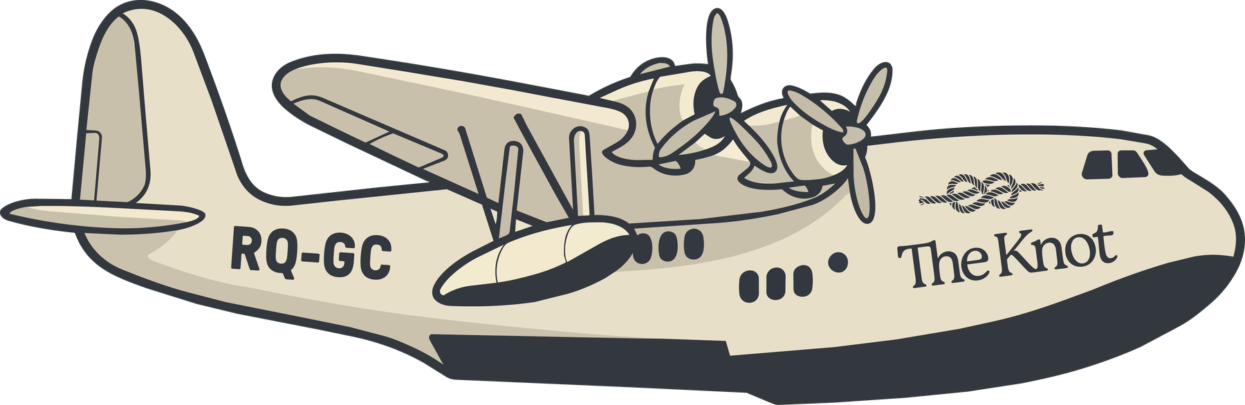
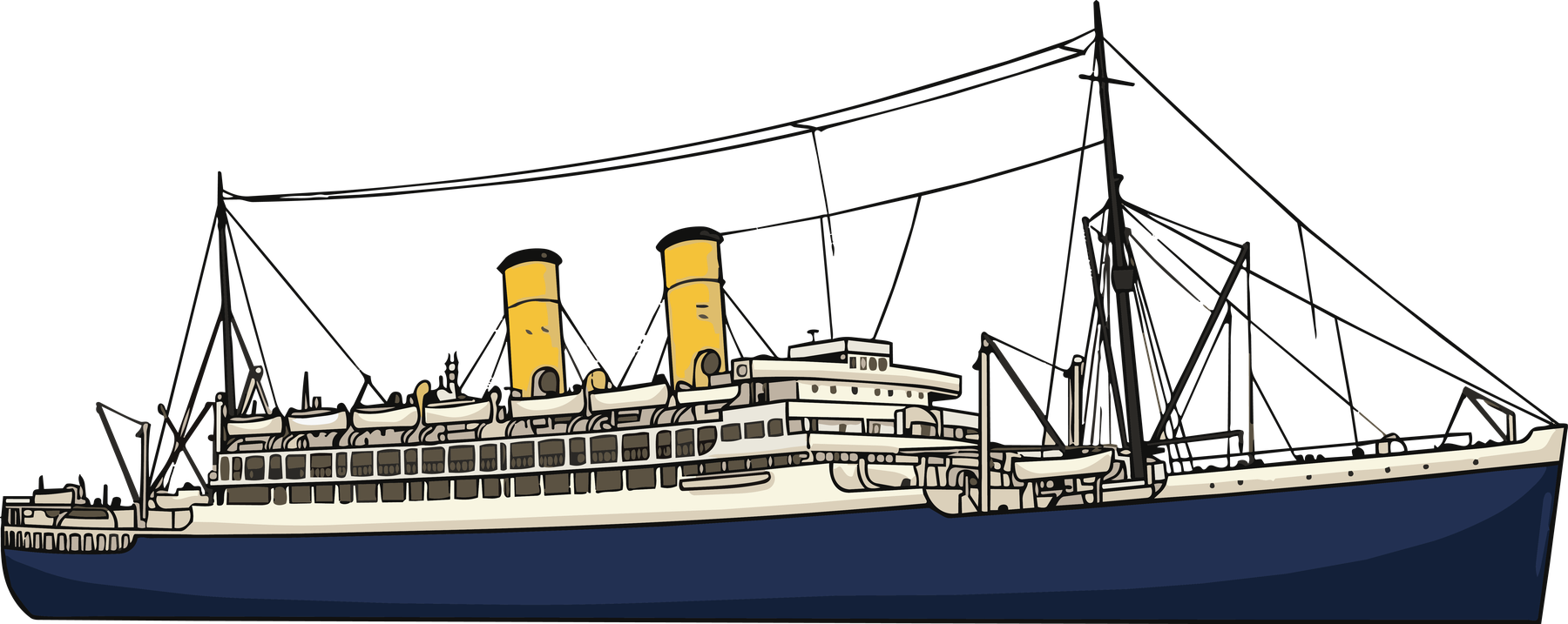
The archival photograph is not a nice piece of history, it is the brief. A liner alongside the 4th and a flying boat overhead, in the same frame as a putt. Two illustrated elements carry that into the brand. They are drawn in the palette and liveried to The Knot, and neither of them is the logo.
The flying boat
Empire flying boats · Brisbane River, 1938
The travelling element. Use it where something is arriving or going out into the world. Invitations, event announcements, welcome collateral, the top of an email. It flies left to right and it is never cropped by the edge of a page.
The steamship
Interstate liners · Hamilton wharves
The anchored element. Use it where something is settled and social. The bar, menus, the pavilion, membership pieces. Its funnels are where the Funnel accent comes from, so it should never be recoloured away from them.
Pending
The routing, drawn in rope
Figure-eight, plate reference
A loose course map of the ten, drawn as one continuous rope in the figure eight of the routing, with each hole falling where it does on the ground. The plate above is the drawing style, not the artwork.
Not yet drawn. Shown here as direction only. Needs the surveyed routing from OCM before it can be set, and it is the one element that has to be accurate rather than evocative.
How they behave
None of these is the logo. They never replace the mark, and they never sit inside the lockup.
One element per surface. The plane and the ship never appear together outside the archival photograph.
They are drawn in palette colours only. No gradients, no drop shadows, no photographic treatment.
Give them the same clearspace as the mark. They are large, quiet and uncrowded, or they are not used.
They are supporting elements, so they never carry the message alone. There is always a mark or a name on the same surface.
08
In the world
The pieces, photographed.
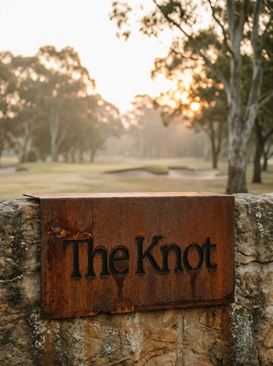
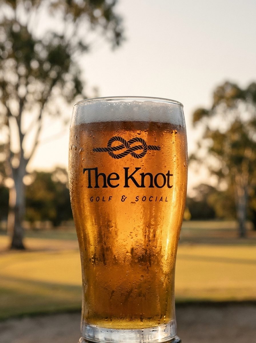
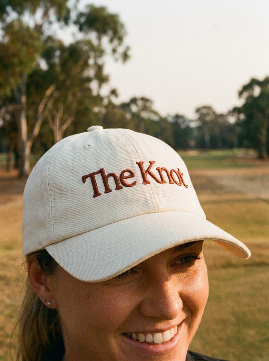
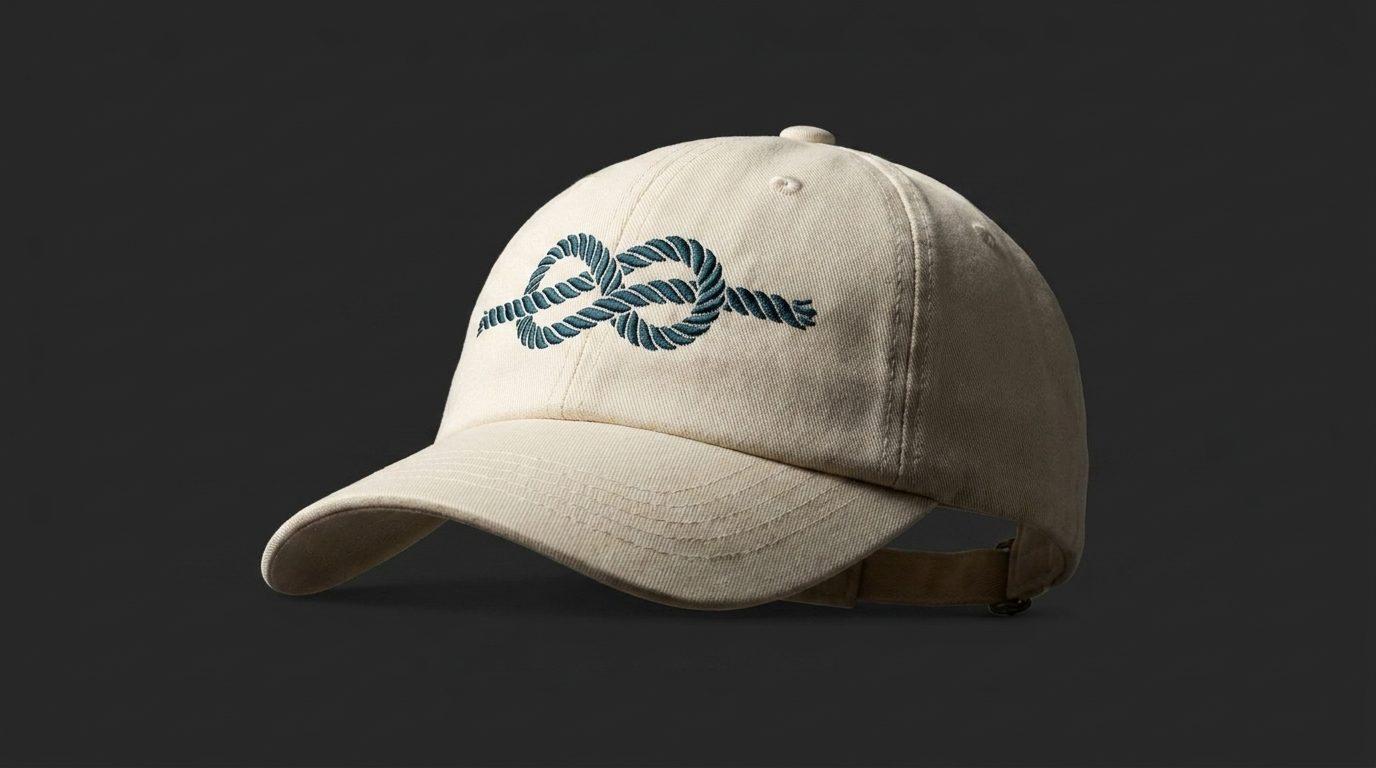
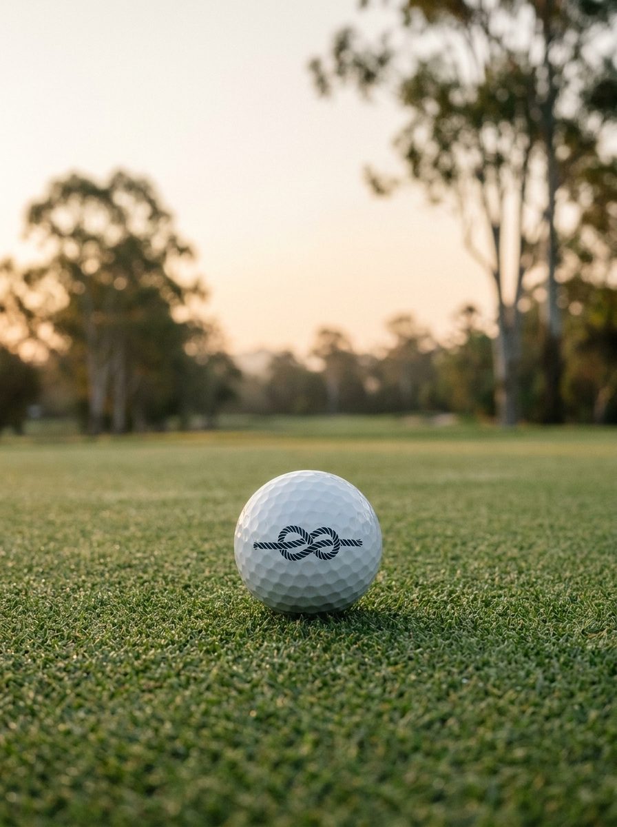
Everything before this is drawn live from the tokens, which is how a system should be shown. This is the other half of the job: real objects, shot on the course, with nothing to read.
Indicative. Product, thread colours and finishes to be confirmed with suppliers.