Contours
Creative review · Royal Queensland Golf Club

Creative review

Royal Queensland Golf Club

Est. 1920 · Brisbane, Queensland

Three directions for the short course.

Concept directions for the new short course brand, presented for discussion ahead of the 5 June direction lock.

3 directions

Scroll to begin

The brief

What we're being asked to build.

A bit of context on the short course project, the brand it needs to support, and how it sits with the Royal Queensland master brand.

01 / 04

The short course

Royal Queensland is building a new short course on the Eastern Land, the parcel on the bend of the Brisbane River that returned to the club this decade. OCM Golf is designing it.

The brief is unusual. Nine holes, walkable, set into rehabilitated salt marsh. A Himalayas putting green at the centre. An island green where the tidal river runs back into the course twice a day. OCM's wandering philosophy means the routing invites a second look. The same hole played at 7am and 11am sits differently because the water level has changed.

The course opens to members next year. This brand sits in front of it.
02 / 04

The brand we're building

The championship club already has a brand. Royal warrants, tournament pedigree, the formal language of a hundred-year-old institution. That brand carries the eighteen and it does that job well.

The short course is a different proposition. Hospitality-led. Sunset drinks on the lawn with the Gateway Bridge arcing overhead. Festoon lights strung between fig trees. A kid running across the Himalayas while parents watch with a beer. Members staying for dinner instead of heading to the carpark after their round.

The brand has to make all of that feel inevitable. Atmospheric, social, warm, confident in being a counterpoint to the formal Royal. The point of difference is the point.

03 / 04

Scope

This is a working brand, not a logo lockup. It runs across course furniture (tee markers, flag pins, on-course signage), printed pieces (scorecards, yardage books, menus), the Eastern Pavilion identity, and merchandise members and guests want to wear off-property. It carries member comms, event invitations, social, digital, and the photography direction for the imagery the place will generate week after week.

The three directions that follow are built to take that load. Where the page shows mockups, those are the actual surfaces the brand will live on.

04 / 04

Brand architecture

The short course brand sits beneath the Royal Queensland master brand, not beside it. The architecture is the endorsed sub-brand model laid out on page 8 of the partnership proposal. Members and guests should always know which club they're at. The short course brand carries its own personality, its own colour, its own naming, but the RQGC mark and warranty are always present at the edge of the system.

In practice that means a clear endorsement line on every visible surface: scorecards, menus, signage, comms. The short course is a Royal Queensland venue. The sub-brand speaks in its own voice, but always with the Royal signature on the page.

Direction 01 of 03

Steamers Golf & Social

Golf, social, riverside. Since 1920.

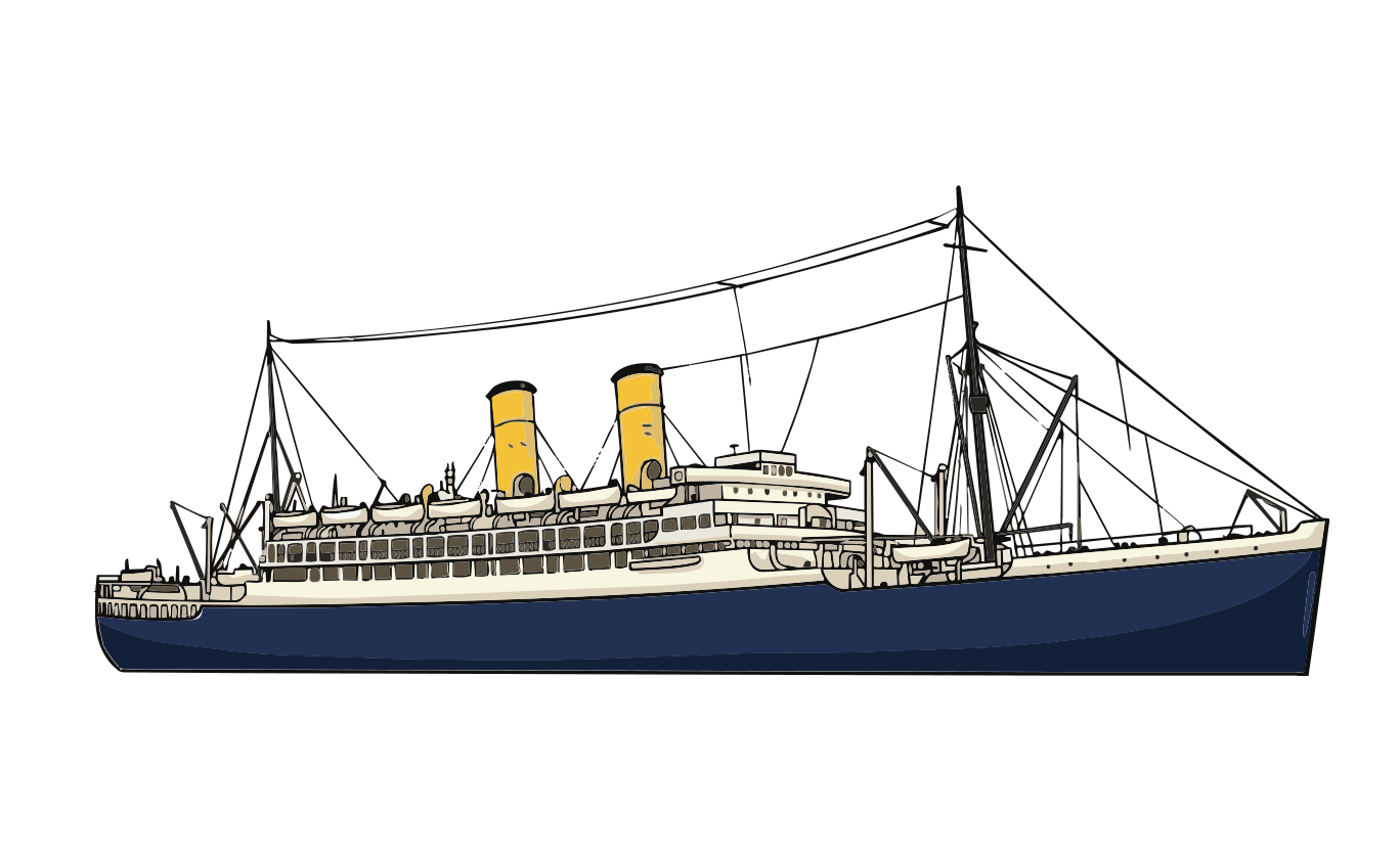
The foundational image. Royal Queensland Golf Club, c.1930s. Golfers on the fairway, an Orient Line liner moored at Hamilton Cold Stores Wharf across the river, a flying boat overhead.

Quick read

  • Built around the iconic course photograph. An Orient Line mail liner moored at Hamilton Cold Stores Wharf, golfers on the fairway, a flying boat overhead. Brisbane, 1930s.
  • Sibling to the championship, not a smaller version of it. Different register: social, riverside, lower stakes.
  • Orient Line colours. Corn yellow funnels with black tops. The historically correct livery the photograph would have shown in colour, and the spine of the brand palette.
  • Vintage transit ephemera as the visual world. Tram tickets, ferry stubs, matchbook covers, hand-set headlines on faded paper.
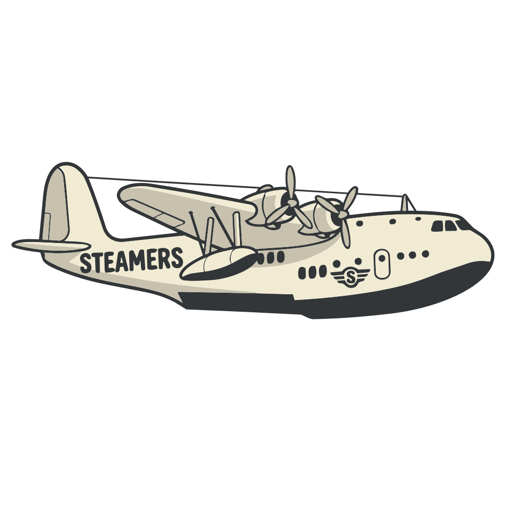
  • Funnels become tee markers, the seaplane becomes the alt mark, the 1920 club flag becomes the course flag. Every detail traces back to the print above the bar.
  • A members' Down the Bay night, once a year. One chartered evening on the river that earns the brand the other 364 days.

The foundational image

The print above runs the brand. Golfers on the fairway, an Orient Line liner moored across the water at Hamilton Cold Stores Wharf, a flying boat overhead. The ship is almost certainly the RMS Orontes or one of her near-identical Orama-class sisters that ran the London to Brisbane mail route through the 1930s. The intent is to hang this image above the new pavilion bar. Direction 01 frames everything around it and earns the right to keep it there by carrying its language through every other touchpoint.

The river that ran past the course

In the 1930s the Brisbane River at Hamilton carried two different worlds at once. The local fleet — the SS Koopa and the larger SS Doomba — ran Sunday excursions from Petrie Bight down to Bribie Island, passing the original course on the way. At the same time the river carried something bigger. The Orient Line's RMS Orontes and her Orama-class sisters, 20,000-tonne mail liners on the London to Brisbane run, moored at Hamilton Cold Stores Wharf — the next bend downstream from the course. The photograph above was taken when one of them was tied up across the water.

A different kind of authority

The championship course carries Royal warrants and tournament pedigree. The short course doesn't need to compete on that ground. It belongs to a different bit of Brisbane history: the picnic-and-orchestra culture that ran along the river in the 1920s, the same culture that produced Henley-on-Brisbane and the Trocadero Dansant. Steamers Golf & Social is the sibling of that culture, not the inheritor of the Royal.

The visual world

The visual register on the right is the world we'd build in. Vintage transit ephemera. Tram tickets, ferry stubs, matchbook covers, steamer manifests. Single-colour letterpress on coloured board. Hand-set headlines and badge lockups. Fare values printed at a size that took themselves seriously. Patina over polish. The palette below is built from the inks of that era.

What the brand earns

The Brisbane River was not the Mississippi and the brand shouldn't pretend it was. The point is simpler. Members take a tee time the way they'd take a ferry. The scorecard tears off like a stub and they keep it. The seaplane in the print becomes the alt mark. The ship funnels become tee markers, painted in the Orient Line liverycorn yellow with black tops, the way the funnels in the photograph read in colour. The 1920 club flag becomes the course flag. Every detail traces back to the print above the bar.

Key moves

  • The photograph above the bar runs the brand. Every applied piece traces back to it.
  • Corn yellow with black tops. The Orient Line funnel livery as the brand's primary colour pair, carried through tee markers, badges, signage and apparel.
  • The visual register on the right is the world we'd build in. Vintage transit ephemera, single-colour letterpress, hand-set headlines, badge crests and monograms, illustration with character. Patina over polish.
  • Three heritage marks, used sparingly. The seaplane as an alt mark. The funnel silhouette as a badge device. The 1920 club flag as the course flag.
  • A social register alongside the golf. Members occasions in the spirit of the era, riverside, considered, earned.

Visual register · references

Palette

  • Orient Buff #f5c33b
  • Funnel Black #1a1d1c
  • Hamilton Reach #2c3e3a
  • Manifest Cream #e8dfc8
  • Bell Brass #a08247
  • Sapsford Red #a13b2c

Typography exploration · live

display

Komu A

via typekit

STEAMERS

Distinctive condensed sans from DizajnDesign. Built for impact at large sizes. The wordmark face.

ABCDEFGHIJKLMN abcdefghijklm 0123456789

Primary wordmark candidate. Komu only ships in a single weight per style, so play with scale, tracking and the A/B variants for variation.

display

Komu B

via typekit

STEAMERS

The B-style variant of Komu. Subtle differences in terminal shape and joinery. Useful as a secondary lockup register or for typography that needs to live next to the primary A wordmark without identically matching it.

ABCDEFGHIJKLMN abcdefghijklm 0123456789

Secondary Komu variant. Same kit, same weight, slightly different character.

body

Newsreader

via google

Down the bay on the Sunday boats.

A modern news-style serif that pairs comfortably with the Komu display. Built for long-form reading on menus, scorecards and member communications without competing with the wordmark face.

ABCDEFGHIJKLMN abcdefghijklm 0123456789

The default body face for the brand.

mono

OCR-A Std

via typekit

TKT 045 · HAMILTON REACH · 1A

A 1968 optical character recognition face. Built to be read by machines first and humans second, which is exactly why it carries the right register for ticket stub serials, fare values and scorecard metadata.

ABCDEFGHIJKLMN abcdefghijklm 0123456789

Technical / ticket-stub face. Always all-caps. Use small and sparingly.

Steamers Orontes illustrated mark
Steamers · Orontes · work in progress
Steamers flying boat vector illustration
Steamers · flying boat mark · work in progress

Steamers · oil painting study of the foundational photograph

Direction 02 of 03

Tideline / Saltmarsh / Causeway

Three names. One idea. A course that breathes with the tide.

Scroll to continue

Direction 02 of 03

Tideline / Saltmarsh / Causeway

Three names. One idea. A course that breathes with the tide.

Quick read

  • Three names on the table. Tideline, Saltmarsh, Causeway. Each takes a different angle on the same central idea.
  • The course breathes with the tide. Twice a day the river comes in, twice a day it goes out. The hazards change shape. Members never play the same round twice.
  • The river is the brand's spine. Brisbane River, by way of the moon. The connection is direct, not nostalgic.
  • Elemental, not historical. Water, light, salt, mangrove, sand. The opposite register to Steamers.
  • Quiet voice, generous space. Modern, restrained typography. Small considered marks. Photography of the water-edge doing the heavy lifting.
  • Built on rehabilitated salt marsh. The course exists because the river was let back in. The brand honours that.

Twice a day

Twice a day the river comes in. Twice a day it goes out. The water hazards on the new course are tidal. Pipes let the Brisbane River flow into the island hole's surround, through the saltmarsh hazards, and back out again on the ebb. The course breathes. The same hole played at 7am and 11am is two different holes. A hazard that was twenty metres of grass at low water is twenty metres of water at high. This is not a feature. This is the course.

The river that makes the course

Where Direction 01 puts the river in the background of the photograph, this direction puts the river in the architecture of the course itself. The Brisbane River, known to the Turrbal people as Maiwar, is the active force. It dredged the land out of mangrove flats in the 1920s and it shapes the holes every six hours since. The course exists because the river was let back in.

Three names, one idea

Three names on the table for the same direction. Tideline is the descriptive option, the line the tide draws on the bank. Saltmarsh is the ecological option, the actual wetland the course was rebuilt from. Causeway is the architectural option, the path across tidal water that you only cross at low tide. All three carry the same idea: a course defined by the rhythm of the water, not by the position of the holes.

The visual world

A technical edge across earthy graphics. Not luxury golf brochure. Scientific publication, museum chart, tide-table, astronomical diagram, encyclopedia spread. The course's tidal rhythm gets translated into data graphics: lunar phase, tide-time, depth, distance. Wave-pattern motifs run as recurring graphic devices. Photography is documentary, atmospheric, often long-exposure — never aspirational. Typography pairs a clean modern grotesque for display with a monospace for the numerical metadata that makes the system visible. The palette warms the technical side with terracotta and silt, cools it with deep water-navy. Nothing in the system competes with the water outside the window.

Key moves

  • The course breathes with the tide. The central observation. Everything else is in service of this idea.
  • The river is the active force, not the backdrop. Maiwar moves the course every six hours.
  • Tidal palette. Mangrove green, silt brown, salt white, sand cream, oyster grey. Inks of the wetland.
  • Quiet voice, generous space. Modern restrained typography, small marks, photography of the water-edge doing the heavy lifting.
  • No mascot, no ship, no historical anchor. The water is the brand. The brand frames the water.

Visual register · references

Palette

  • Maiwar Navy #1e3050
  • Tidal Ochre #a85c40
  • Mangrove Green #2e4030
  • Silt Brown #7a614a
  • Sand Cream #dac9a6
  • Salt White #f5f3ec
  • Tide Black #1a1d1c

Typography exploration · live

display

Inter

via google

TIDELINE

A modern grotesque carrying the EARTH-poster register. Heavy at display, quiet at small. Built for technical editorial work where the page itself is doing the heavy lifting.

ABCDEFGHIJKLMN abcdefghijklm 0123456789

Primary display. Pairs with a monospace for the metadata register.

mono

IBM Plex Mono

via google

TIDE H 04:23 · L 10:48 · H 17:12

Technical metadata face. Tide times, distances, dates, depths, fare numerals — the system data that makes a tidal course tidal. Sits next to the display grotesque as the second voice of the brand.

ABCDEFGHIJKLMN abcdefghijklm 0123456789

The data voice. Always small, always considered, always factual.

body

Newsreader

via google

The course that breathes with the tide.

A modern news-style serif kept from the body-text role across both directions. Pairs cleanly with the geometric sans above without competing.

ABCDEFGHIJKLMN abcdefghijklm 0123456789

Body face shared with Direction 01 for cross-direction consistency.

Direction 03 of 03

The Strand at Royal Queensland / The Lawns

A short course you stay for.

Scroll to continue

Direction 03 of 03

The Strand at Royal Queensland / The Lawns

A short course you stay for.

Quick read

  • A place, not a course. The brand starts with the experience: rolling riverside walk, fig trees framing the bank, the Gateway Bridge arcing overhead, festoon lights at the pavilion, wood-fire kitchen, kids on the Himalayas. Members make a day of it.
  • Two names on the table. The Strand (refined, hospitality-formal) or The Lawns (plural, outdoor, family-led).
  • Hospitality leads, golf follows. The pavilion is the protagonist; the course is the lawn it sits on.
  • Formal language, warm execution. Country-estate formality, Brisbane warmth. Embossed seals, Didone serifs, brass, terracotta, dusty blue, palm shadow.
  • The third leg of the deck. Steamers looks back, Tideline looks down at the science, this one looks around the room. Inclusive of golfers, non-golfers, families, guests.
  • A multi-level system. The Strand for the brand, The Lawns for the outdoor social space, and a separate restaurant name inside the pavilion (Birdies on the Banks is a strong candidate).

A place, not a course

The new short course is not a brief. It's a place to spend a Sunday afternoon. Long sunsets at the Eastern Pavilion. Festoon lights strung between fig trees. The Gateway Bridge arcing overhead. Wood-fired pizzas and Moreton Bay bug rolls coming out of the kitchen. Kids running across the Himalayas putting green while parents watch from the lawns with a drink. The course is the lawn the pavilion sits on. The pavilion is the brand.

The Strand, or The Lawns

Two names on the table for the same idea. The Strand at Royal Queensland takes the formal route. The Strand is old English for the shore or water-edge; Townsville's iconic foreshore carries the name today, and London's Strand runs parallel to the Thames. The name has restaurant pedigree built in. It sounds like a Brisbane riverside venue you'd book on a Sunday, somewhere you'd dress up but not stiffly.

The Lawns is the alternative. Plural, casual, outdoor. References the actual lawns around the pavilion and the Himalayas putting green. "Meet me at the Lawns" is the kind of thing a member says to a guest on a Friday.

A different kind of formality

Steamers' formality is Edwardian and historical, ink-on-paper. Tideline's formality is scientific and austere. This direction's formality is hospitality — country-estate stationery and boutique restaurant identity re-imagined for Brisbane. Embossed seals. Wax-stamp monograms. High-contrast serifs on linen and marble. Hand-painted signage above doors. Brass fixtures. Considered ornament.

The trick is to land the formality with warmth, not stiffness. The Strand is host-like, not concierge-like. It welcomes the kids running through with the same composure as the Sunday lunch table for eight.

The visual world

The reference set lands the register precisely. Hartham Park's terracotta-and-dusty-blue estate restraint. Le Jardin's Didone serifs on marble. Farfatella's stencil-cut red on cream paper. Camelia's delicate botanical line. Long Stemmed Rosés' italic accent paired with mono small-caps metadata. All translated to a Brisbane setting — palm shadow rather than English oak, festoon lights rather than chandeliers, the Eastern Pavilion rather than the manor house. The course is photographed at golden hour, not noon.

What the brand earns

The Strand becomes the membership's social life. Sundays. Birthdays. After-work drinks. The bar with friends. The Christmas function. The walk along the river before the round. The Himalayas putting comp on a Friday night. The wedding party at the pavilion. The course is the reason the place exists; the place is the reason members keep coming back.

Key moves

  • Hospitality leads, golf follows. The pavilion is the protagonist of the brand, not the holes.
  • Formal language, warm execution. Country-estate stationery cues delivered with Brisbane warmth. Considered, never stuffy.
  • The visual world sits between estate and restaurant. Embossed seals, Didone serifs, hand-painted signage, terracotta and dusty blue. Brisbane-translated, not borrowed.
  • Family-inclusive, plural, riverside. The Lawns alt-name carries the casual half. The Strand carries the formal half. Members switch between them naturally.
  • A multi-level naming system. Brand at one level, outdoor social at another, restaurant at a third. Each name does one job well.

Visual register · references

Palette

  • Strand Red #c8463a
  • Estate Blue #adb6c0
  • Brass Fixture #b58e55
  • Terracotta Tile #c97d5a
  • Palm Shadow #1f3325
  • Festoon Cream #f4ebd5
  • Wood Fire #2c1e18

Typography exploration · live

display

Cormorant

via google

The Strand

An elegant Garamond-cousin with restraint and warmth. The wordmark candidate. Reads as hospitality, not as wedding invitation.

ABCDEFGHIJKLMN abcdefghijklm 0123456789

Primary display. Pairs naturally with Newsreader for body. If we lock the direction, worth upgrading to Adobe Caslon Pro for production.

accent

Playfair Display

via google

The Lawns

A more dramatic high-contrast option for the alt-name treatment. Use sparingly — for headlines, awning signage, the wordmark moment. Not for body.

ABCDEFGHIJKLMN abcdefghijklm 0123456789

Alternative display. Used at the level a Riviera hotel uses its signage.

body

Newsreader

via google

A short course you stay for.

The body face shared across all three directions. The consistent thread that holds the deck together.

ABCDEFGHIJKLMN abcdefghijklm 0123456789

Body face shared across the whole deck.

04 · What's next

Direction lock.

After the kickoff discussion we lock the chosen direction by 5 June and refine through June for the 1 July delivery.

  1. 01 Group discussion of the three directions at the 28 May kickoff.
  2. 02 Sean and the team take 48 hours to sit with the work and consolidate feedback.
  3. 03 Direction lock confirmed by Thursday 5 June.
  4. 04 Refinement of the locked direction through June.
  5. 05 Short course brand guide delivered 1 July.